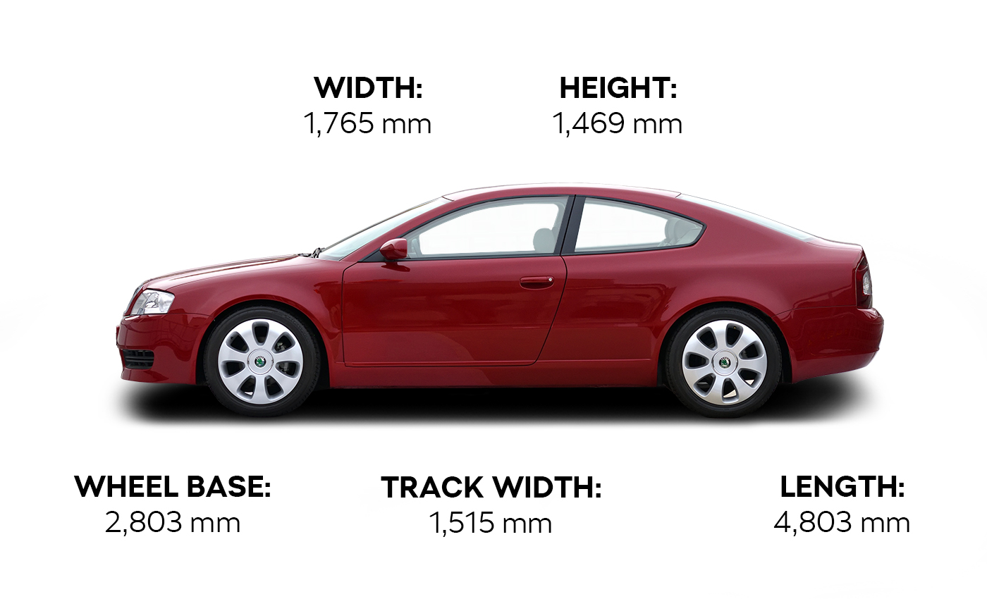
The stylish sign on the tailgate was one of the most characteristic details of the ŠKODA TUDOR, and you might be interested to know that by this point the designers were already inspired by Bohemian crystal when coming up with a font. “We were looking for a suitable font to be used for the name, something different from the then official font, something simple yet striking,” says Zdeněk Cibulka. The new font was crisp-cut and textured to resemble cut glass. A few years later, this style was developed further, gradually morphing into the entire structure we now see across all current ŠKODA models.
The original grey-and-brown metallic paint was replaced with dark red shortly before the public premiere at the Geneva Motor Show in 2002. The TUDOR garnered well-deserved admiration there, and it was then put on display to the Czech public at the ŠKODA MUSEUM in Mladá Boleslav.
The TUDOR subsequently travelled to an exhibition in India where, under rather dramatic circumstances, it got lost after the event and was not found until several months later at a train station following an intensive search by the authorities. On its return to the Czech Republic, the car had to be completely renovated.
“Whenever I see it at the Museum, I still feel proud of how good a car we designed all those years ago,” says Zdeněk Cibulka, concluding his reminiscences of the TUDOR.


