› ŠKODA AUTO introduces new corporate identity linking its rich history to the future of mobility
› New brand picturemark for enhanced appearance on digital communication channels, wider use of new ŠKODA wordmark
› New brand identity will first be introduced in information and communication materials, also to be featured on future models
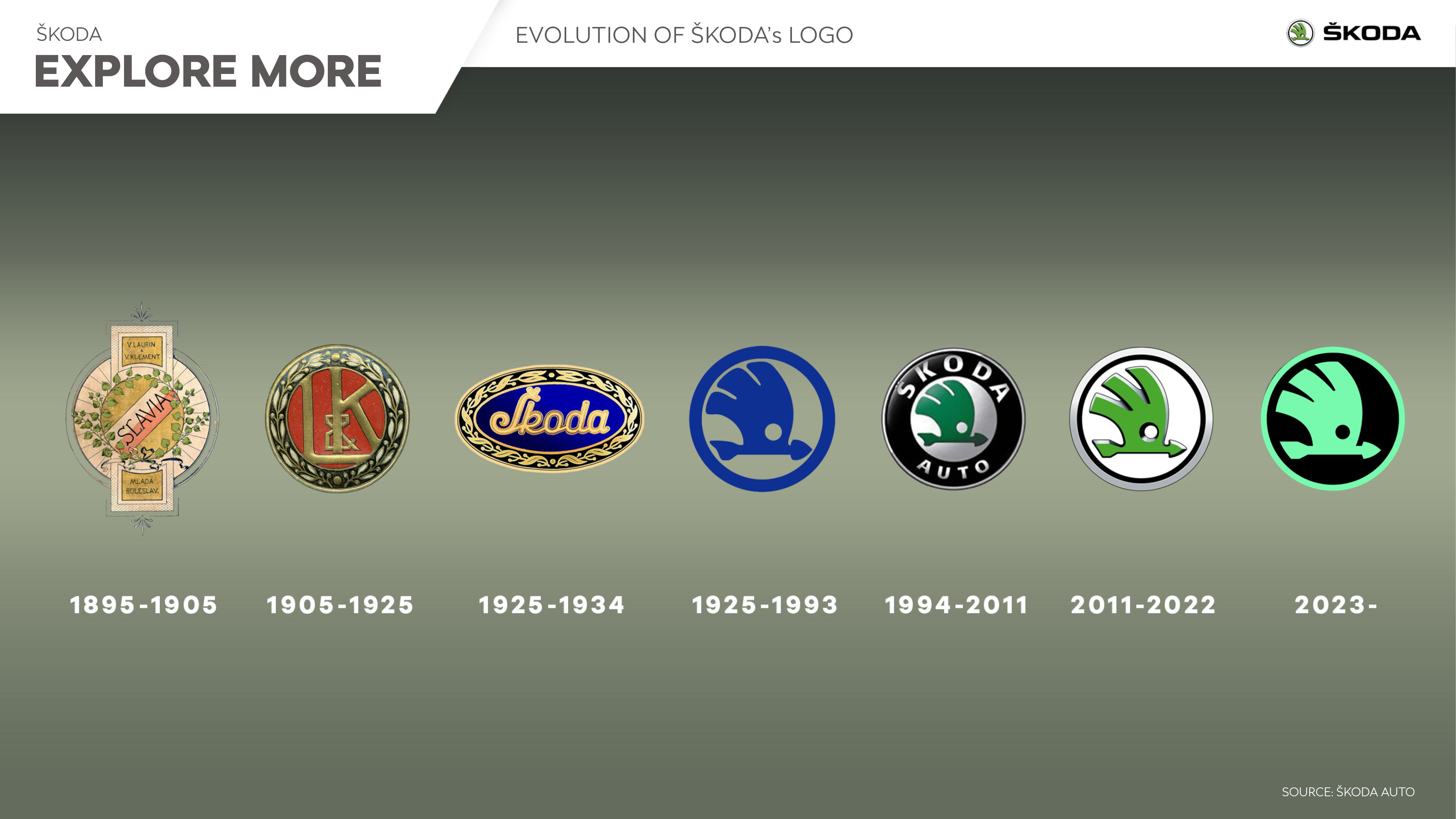
Mladá Boleslav, 30 August 2022 – ŠKODA AUTO is taking its brand appearance to the next level with the most radical change to its corporate identity (CI) in 30 years. A new brand picturemark will be used to enhance the brand’s appearance on digital communication channels. The ŠKODA wordmark will be used more widely than the company’s picturemark. ŠKODA’s new brand identity will first be introduced in information and communication materials and then rolled out in future models.
“With our new CI, we’re taking the whole brand appearance to the next level. It’s not only our product portfolio that’s evolving but also our customers. And we see this as the perfect opportunity to make our brand fit for the decade of transformation and adjust its look and feel to the needs and expectations of our customers. Our new CI underlines the modern and distinctive design and clearly shows our digital first approach.”
Martin Jahn, ŠKODA AUTO Board Member for Sales and Marketing
Under the Marketing department’s guidance, employees from across the company were involved in developing the new CI. In addition, 2,200 people from six key markets – the Czech Republic, Germany, India, Israel, Italy and Norway – were surveyed on selected logo versions from a total of 165 designs in order to determine the future logo.
New ŠKODA wordmark to be used much more than the picturemark
The ŠKODA wordmark will be featured more widely than the company’s picturemark in marketing communications. The new styling uses entirely different typography based on symmetry and a combination of round shapes with borders. The most challenging element was integrating the caron above the S, which represents an important part of ŠKODA’s Czech heritage. The so-called háček is now integrated into the first letter. The research found that the typographic wordmark is easier to recognise and identify.
The new picturemark: Emphasising digital communication
The winged arrow symbol has also been transformed, although not as radically as the wordmark. Its simplified design is apparent at first glance. ŠKODA’s new picturemark will now be rendered without plastic 3D graphics. This is how the car manufacturer is responding to the shift towards even more digitalised communication. The simpler, two-dimensional picturemark is much more impactful, especially on mobile devices, and can also be integrated more flexibly into different formats.
New CI: Colours that symbolise electromobility and sustainability
ŠKODA AUTO will use two different green hues in its colour scheme: Emerald and Electric Green. In surveys, many respondents associated these colours with ecology, sustainability and electromobility.
The new CI will be gradually rolled out across all platforms – first in information and communication materials, and from 2024, it will also start appearing on newly launched models. The new design will also be reflected in the infotainment and other elements of ŠKODA vehicles. The revamp will also involve design changes to the premises of authorised partners.

Vítězslav Kodym
Head of Product Communications
T +420 326 811 784
vitezslav.kodym@skoda-auto.cz
Štěpán Řehák
Spokesperson for Product Communications
T +420 734 298 614
stepan.rehak@skoda-auto.cz


